Did you know that 99.95% of the people on Fandom are readers, not editors? Admins tend to focus almost exclusively on the needs of their fellow editors, since readers leave no visible trace. Yet while wikis can’t exist without editors, their content is useful and enjoyable to a far larger audience. Many more people rely on the content you create and appreciate your work than you might have thought. It’s crucial that you keep this in mind when organizing your wiki’s local navigation bar, to make it as useful to your audience as possible.
(Can’t be bothered to read all this? Jump to the bottom for a summary!)
Fandom’s User Experience Research team has looked into how users typically move around on a wiki and where they click (and where they don’t). As it turns out: Most users don't enter a wiki via its main page, and even those who do rarely click main page elements such as sliders or character galleries. Instead, users rely heavily on the local navigation bar to find their way around. Apart from Search, this is the most powerful tool for a community's visitors to locate the information they’re after.
Visitors should find what they're looking for easily, and be able to gauge very quickly what other kind of content there is to explore on a wiki. This avoids frustration and disappointment, and increases the likelihood that causal visitors will come back more often, have a more positive view of that community, and might even want to become an active part of it.
Build a navigation bar for those who use it most, not just for yourself
Focus on content namespace links and categories
Since the vast majority of visitors look for articles, your local navigation should consist of links to content namespace pages and categories. This requires your wiki's content to be organized in clear and sensible categories to begin with.
Some elements are built into every wiki's local navigation and can't be changed (“Explore” and “Discuss”). Those navigation items that you can customize therefore need to represent the top articles and category structure of the wiki. For instance, a TV wiki should contain links to character, season, episode and possibly cast categories. A Gaming wiki will likely need links to categories such as characters, items, weapons, gameplay, bosses, etc.
If a wiki covers a multi-installment franchise, like e.g. Assassin’s Creed with the multiple different Assassin’s Creed games, or the Marvel Cinematic Universe with multiple movies and TV series, the local navigation should enable visitors to find information specific to the installment they're looking for - for example, contain top level items for each installment with sub-menus, if there is enough space. If there is not enough space, and the wiki's topic is just too complex, the installments can be listed as second-level items.
If your fandom had a recent release, most visitors to your wiki are likely looking for information specifically about this latest installment. This should be your first top-level item on the left side - just like the Final Fantasy Wiki is listing content on Final Fantasy XIV: Shadowbringers in its most visible spot.
Avoid duplication
Space in your local navigation is limited, so make sure you don't include multiple links that serve the same or similar purpose, or links to pages or features that are already linked elsewhere, such as the page creation tool, Fandom's support request form, or Recent Changes, which anyone using it regularly can add to their bottom toolbar. Customize your toolbar to give yourself one-click access to your most frequently used tools and special pages instead subjecting all wiki visitors to links that are mostly irrelevant to them in your top navigation.
For example, there is no need to include links like “create a new page” or “contact Fandom staff” in your local navigation, since there are buttons for that already built into every single wiki page on Fandom.
Links to editing tools should not be in a local navigation at all, and links to guideline pages such as editing rules, style guides, wiki staff overview, etc. should not feature prominently either. Instead, links to pages aimed at editors and regular members should be added to Special:Community (if enabled), which is linked by default in the local navigation under “Explore”. Where this feature is not enabled, one link to a community portal serving as a landing page for editors can be put in the navigation bar.
Consolidate and label clearly
If multiple related items can be included under one header, consolidate them. For example, instead of having the separate top level items “Good Guys”, “Bad Guys” and “Side kicks”, consolidate them under one item you could, e.g., name “Characters”. This will save you space that you can use to showcase other top categories.
Use labels that are as brief and specific as possible. For example, avoid generic labels like “Top content”, “General information”, or “Articles”. These don’t tell your visitors what’s behind them unless they expand the next level menu. If your wiki is about a game, there is no need to label links as “Game characters”, “Game levels” and “Game locations” - just name them “Characters”, “Levels” and “Locations”.
Don’t use your wiki’s general topic as a top item label. For example, if your Wiki is about Awesome TV Show, don’t have a top level item called "Awesome TV Show". If you find this necessary, you’re probably using too much navigation bar space on other things that are not top articles and categories, and should reconsider how you’re using your space. Ideally, you should be able to fit at least three article or category items into your navigation bar. That means, instead of listing the second-level items "characters", "seasons" and "cast" under "Awesome TV Show", you can fit them in separately as top level items.
If your wiki’s topic has several installments, such as movie sequels or a game series, and you have similar categories for each installment, group content together per installment, not per category. For example, if your wiki is about Fallout and contains pages on weapons, locations and characters for each one of the Fallout games, your navigation items should be "Fallout 4", listing the weapon, location and character pages pertaining to Fallout 4 on the next level, "Fallout 3", with weapon, location and character pages for Fallout 3 on the next level, and so on.
This is better than having a top level item "Weapons" and then dividing it into "Fallout 1 weapons", "Fallout 2 weapons", and so on, since a visitor coming to your site is likely only playing one of the Fallout games right now. They want weapon, location and character information just for Fallout 3, for instance, and shouldn’t have to search through multiple sub-menus for articles on the same game.
Case examples
Here are two typical examples for navigation bars that focus far too much on editors, aren’t making the best possible use of the limited space available, and are not facilitating a smooth path to the wiki’s most relevant pages. The corresponding wikis are already working on improving their navigation, based on the best practices described here, with the help of our wiki managers.

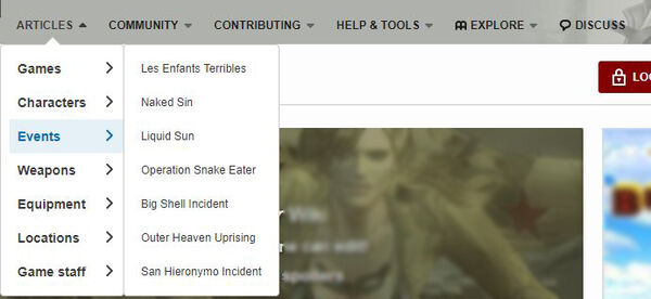
- Only one top level item actually contains links to the wiki's article content, and that has a generic, unhelpful label ("Articles")
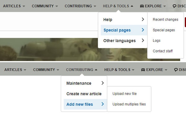
- "Community", "Contributing" and "Help & Tools" are all aimed mostly at editors, ignoring the needs of almost every visitor on the wiki and not showcasing the great work of those editors.

- There are many unnecessary links and duplicates, such as "Special pages", which is linked on two levels, and "create a new page", "other languages" and "contact staff", all of which can be found elsewhere on the page.
- One top level item is "Help & Tools", and yet additional tools are found under "Contributing". While none of these links need to be in the nav bar at all, at the very least, they should be grouped together under one top level item, to leave more space for top articles and categories.
Another example:

- The top level items don’t give any hint at what kind of content and content structure users can expect here.
- "Popular Pages" is the only item that even contains articles and categories relevant to the vast majority of visitors to the wiki, and the label is unhelpful. As a reader, I usually want a straight path to exactly what I’m looking for, not see what is popular with everyone else.
- The automatically populated sub-level menus under "Popular pages" are prone to duplicating links that are already on the second-level menu. For instance, the Beginner’s Guide is one of the only pages featured in the navigation, so of course it is going to be one of the most visited pages.

- "Community" only contains one single item, which could have just been put on the first level - or left off the navigation entirely. Only a community with extraordinarily active bloggers who post relevant content regularly should include the recent blogs list in their navigation.
- This navigation doesn't fill out the available space. Another item showcasing more of the relevant content should be added.
These wikis are already following some of these best practices:
- Here, much more space is given to links to relevant content and category pages.
- Although there are still some editor-centric links, they are at least summarized under one top-level menu item.
- Navigation items have clear and concise labels.
- Almost the entire navigation here is dedicated to articles and categories visitors are likely looking for.
- Labels are concise.
- The navigation acknowledges that most people are probably looking for information on the latest game by putting information on that first.
Tl;dr
Do
- Remind yourself that nearly everyone visiting your wiki is here to read articles.
- Focus your local navigation on pages and categories readers are looking for - why else are you and your editor community creating such great content?
- Use clear and concise labels.
- Utilize all the available space in your navigation.
- Use the bottom toolbar and other site elements to access editor tools, rather than the navigation bar.
Don't
- Create a local navigation bar that’s only really useful for editors (editors have many other ways to find tools, guidelines and special pages).
- Use generic labels like "articles", "top content", or "popular pages"
- Include links to tools or pages that already have built-in links in the interface, such as "Contact Fandom staff", "Create a new page" or "Special:Upload".
- Waste precious nav bar space by having only one or few sub-level items under a header, using unnecessarily long labels or including links that are only relevant for a very small percentage of visitors.
Would you like to implement some of these tips, but don’t know where to start? Your wiki manager is happy to help! If your wiki doesn’t have one, share your questions here in the comments or compare ideas in the forums!
Click here to follow the Fandom staff blog.
Click here to sign up for the From the Desk of Community email newsletter.
Join our Official Discord server for registered editors!
