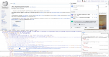
OOUI components expect 0.8em (12.8px), not 0.875 (14px), so the icons will render blurry.
Description
Event Timeline
I disagree. Certainly fixing T97631 would resolve this, but it can also be fixed independently (cf. VisualEditor, Flow)
While we could do that, I'm not sure it's realistic to expect every component that wants to use OOUI to use a different font size than the rest of the skin.
This is not quite magically fixed by T97631. Echo has a bunch of weird overrides for font-size and width/height/min-width/min-height, which need to be examined and hopefully deleted.
Removing task assignee due to inactivity, as this open task has been assigned to the same person for more than two years (see the emails sent to the task assignee on Oct27 and Nov23). Please assign this task to yourself again if you still realistically [plan to] work on this task - it would be welcome.
(See https://www.mediawiki.org/wiki/Bug_management/Assignee_cleanup for tips how to best manage your individual work in Phabricator.)
Icons in grouped notifications are 21x21:
There might be other problems, I didn't look at everything. This is just the first obvious one.
