Page MenuHomePhabricator

User links: Logged-out user links menu treatment
Closed, ResolvedPublic5 Estimated Story Points

Description

NOTE: adding icons is out of scope for this task. Will be handled in T276562

Background

As a part of T266536: [EPIC] Consolidate user links into a single menu, we are building a new treatment for the user menu with the goal of providing a clearer and more intuitive experience when accessing user links. In T276562: User links, Skins: Provide generalized way to add icons to user links dropdown menu" and T276561: User links: Logged-in user links menu treatment without icons (for anonymous users no change) we built the user links menu for logged-in users. This task tracks the user menu for logged-out users.

Acceptance criteria

  • For logged-out users only, collect the following links under a single menu: log in, talk, contributions
  • Add explanatory text for the talk and contributions functionality. Copy: "Pages for logged-out editors (learn more)"
  • Learn more links to: https://en.wikipedia.org/wiki/Help:Introduction

Design

image.png (956×1 px, 360 KB)

Current menu appearance

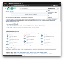
Screen Shot 2021-05-06 at 10.32.01 AM.png (82×700 px, 13 KB)

QA Results - Beta

ACStatusDetails
1T276564#7138428
2T276564#7138428
3T276564#7138428

Related Objects

Event Timeline

ovasileva raised the priority of this task from Medium to High.May 3 2021, 1:40 PM
Jdlrobson removed Jdlrobson as the assignee of this task.EditedMay 5 2021, 5:01 PM

We can estimate this with the assumption that https://gerrit.wikimedia.org/r/c/mediawiki/skins/Vector/+/683776 has been merged. The feature flagging has been setup for anonymous users, so I think the main difficulty here is going to be the "learn more" messaging at the top of the menu. This suggests a new type of component that is similar to the Dropdown. Time for a UserMenu component perhaps?

For the introduction link we'll need to make use of a mediawiki message e.g. vector-introduction-link who's contents are the title of the page to link to. If the message is empty do not render this help message . If it isn't use it to create the link.

Change 686781 had a related patch set uploaded (by Bernard Wang; author: Bernard Wang):

[mediawiki/skins/Vector@master] Consolidate user links into dropdown menu for logged out users

https://gerrit.wikimedia.org/r/686781

@alexhollender The mocks seem to have a minimum width or width, do you have a particular value in mind? I've been using width: 12em or 192px, which looks like this: https://jmp.sh/Bz4MeqL

Jdlrobson assigned this task to bwang.
Jdlrobson added a subscriber: bwang.

@alexhollender I pointed @bwang to T276566, we'll worry about the min-width as part of that task, so any thoughts should be added there.

bwang removed bwang as the assignee of this task.May 25 2021, 9:36 PM
bwang moved this task from Doing to Code Review on the Web-Team-Backlog (Kanbanana-FY-2020-21) board.

@alexhollender The mocks seem to have a minimum width or width, do you have a particular value in mind? I've been using width: 12em or 192px, which looks like this: https://jmp.sh/Bz4MeqL

hmm, hard to know for sure what a good width will be until we get some translations for that message in. In the prototype (link) it's set at 180px, and is a fixed-width. So maybe that's a good starting point for now.

Change 686781 merged by jenkins-bot:

[mediawiki/skins/Vector@master] Create new user menu template for consolidated user links in logged out users

https://gerrit.wikimedia.org/r/686781

Test Result - Beta

Status: ✅ PASS
Environment: beta
OS: macOS Big Sur
Browser: Chrome
Device: MBP
Emulated Device: NA

Test Artifact(s):

QA Steps

✅ AC1: For logged-out users only, collect the following links under a single menu: login, talk, contributions
✅ AC2: Add explanatory text for the talk and contributions functionality. Copy: "Pages for logged-out editors (learn more)"
✅ AC3: Learn more links to: https://en.wikipedia.beta.wmflabs.org/wiki/Help:Introduction

Screen Shot 2021-06-07 at 6.36.30 AM.png (1×1 px, 385 KB)

Jdlrobson added a subscriber: Edtadros.

This can skip QA in production. It can't be tested there until the feature is deployed. We will do that prior to releasing the feature.

ovasileva claimed this task.

Which is the rational, research or thought process behind hiding the login button?

Seems like a good question, but also what is your rationale for showing the login button here?

The rationale is simple:

  • We use the create account once in our lives and the login button very frequently. Making people click two times instead of one is against UX.
  • The only real difference between logged out and logged in users is that logged out users can log in and logged in users can log out. This difference is what says you if you are logged in or logged out (as far as there is no new design change that indicates visually that you are logged in, i.e. a darker sticky header).
  • Account creation and login buttons are both appealing to create a new account. Having both helps people understand that they can create an account and that, once done, they can do ''more'' things.

So, after 6 weeks, no answer on why it should be buried. This is an obvious accesibility problem (T91201), the issues are huge, and when asked why this decission was taken, there's no explanation.

Please create a new ticket capturing any remaining issues.

The ticket was created 30 months ago.

  NODES
HOME 1
mac 1
macOS 1
Note 4
os 14
text 12
Users 23
visual 1
web 14