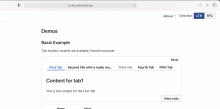
Codex Tabs and Tab (Tabbed layout) component
A layout for arbitrary content consisting of multiple panels (only one of which is visible at a given time) and a horizontal row of labels for navigation. This is a common pattern and it is used widely across Wikimedia products.
Ideally the Codex version of this component should blend in seamlessly with prior implementations (OOUI, etc), featuring only user-experience improvements as changes.
Screenshots (from Figma)
Framed user-interface variant
Quiet user-interface variant
To do
Design
- Finalize Figma design for this component (include disabled states for both styles if necessary)
- Publish component in our Codex library
UX
- Ensure scrolling behaviour meets expectations.
Code
- Implement Vue 3 compatible version of Tabs and Tab components
- Replace 'frameless' with 'quiet' in code and documentation
Design Review (see https://phabricator.wikimedia.org/T303321#7834644 for more details)
- Fix Tabs hover styles in Chrome (patch; live demo)
- Adjust Tabs header spacing to match Figma specs (patch, live demo)
- Ensure both framed and frameless outline styles use rounded corners (top left and top right corners only) (patch, live demo)
- Separation between tabs should be 4px in both normal and framed tabs (patch, live demo)
- Limit gradient-indicator width to 24px
- Fix 1px of separation between tabs and gray line in Safari
-
1px separation between tabs and gray line when you resize the component (Safari and Chrome)we'll track this in T307491 - Fix gray gradient when the tabs are scrollable in both Quiet and Framed tabs (Safari)
QA & Release
- QA and accessibility testing
- Inclusion in Codex release


